


Zapier
Connect with thousands of apps. No code required, automate workflows in minutes.
BlueFox Email includes everything serious email platforms offer, without hiding features behind upgrades.
You only pay for sends.
Join companies that deliver exceptional email campaigns with BlueFox Email


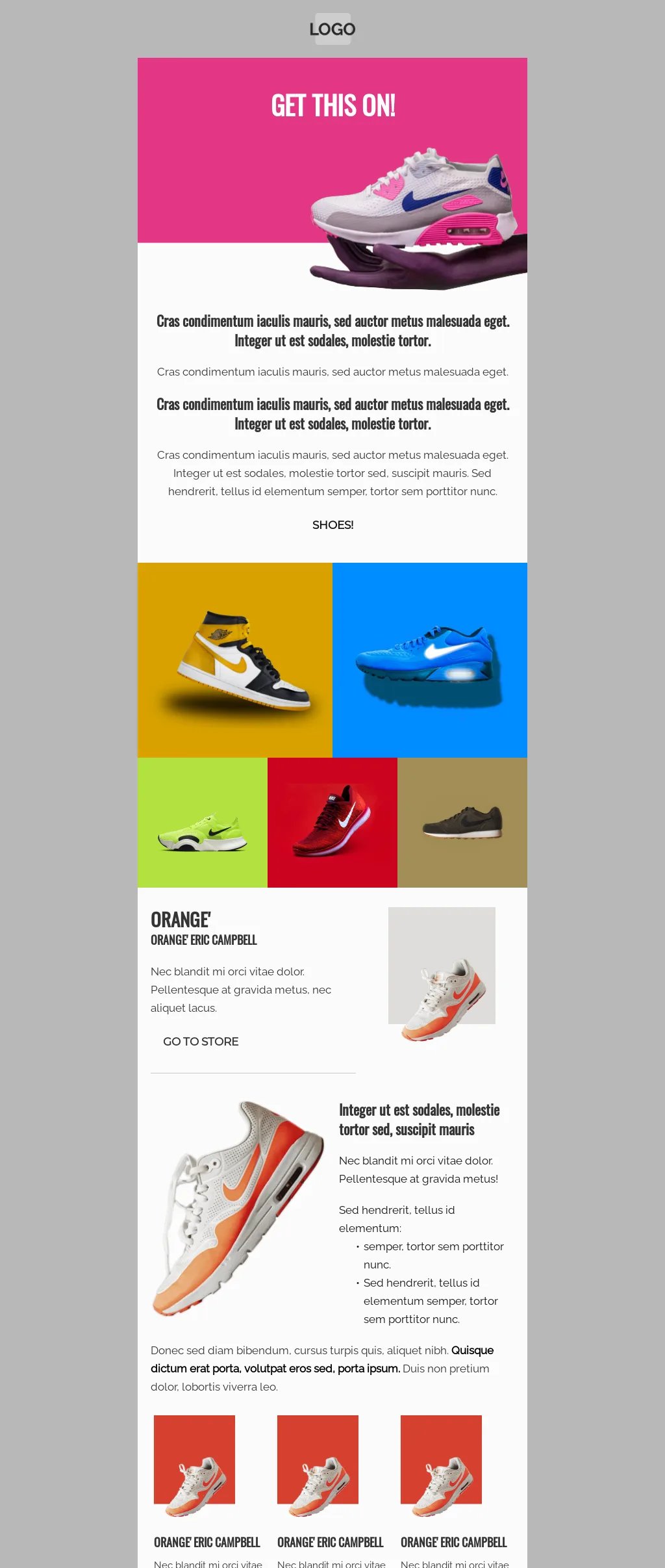
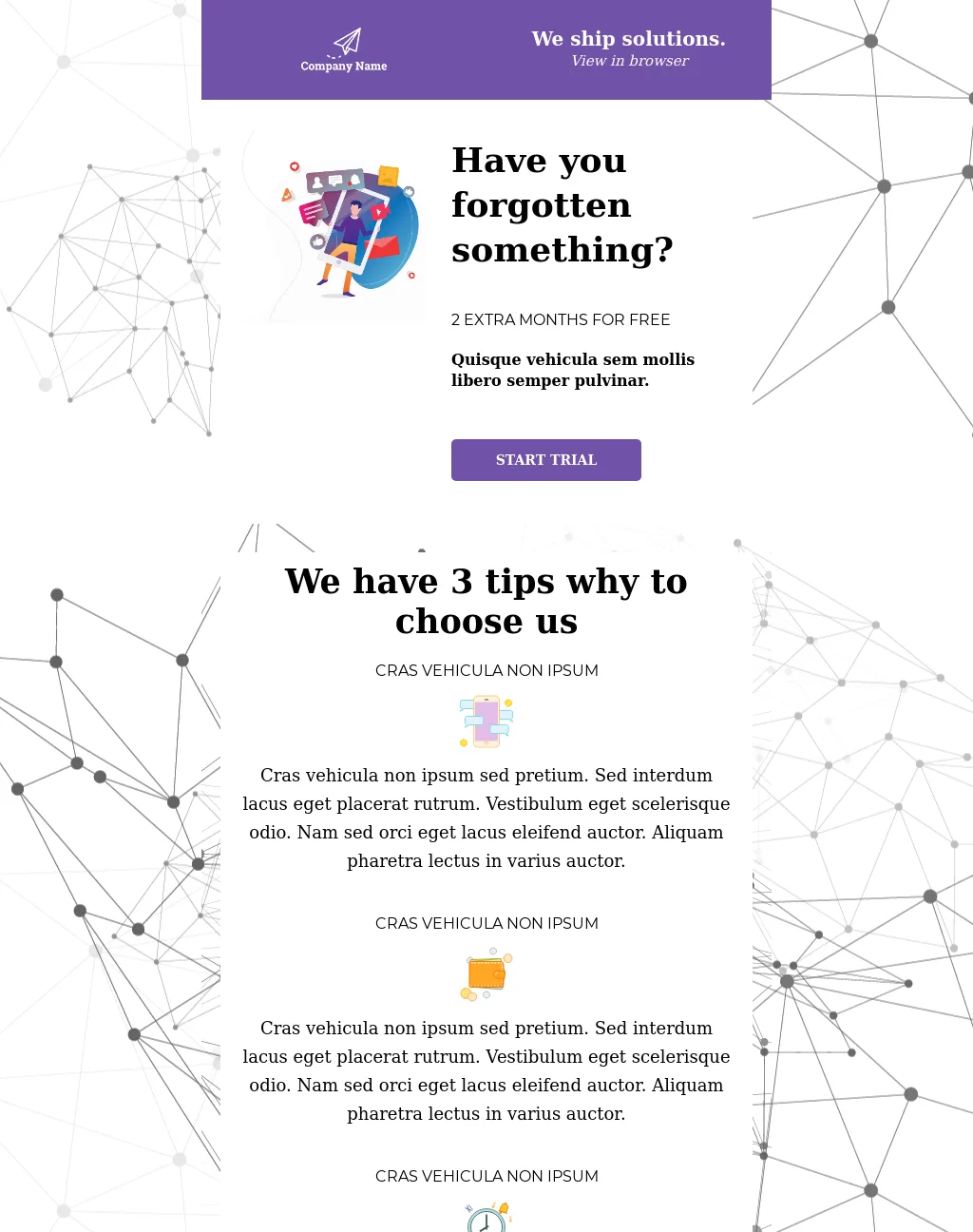
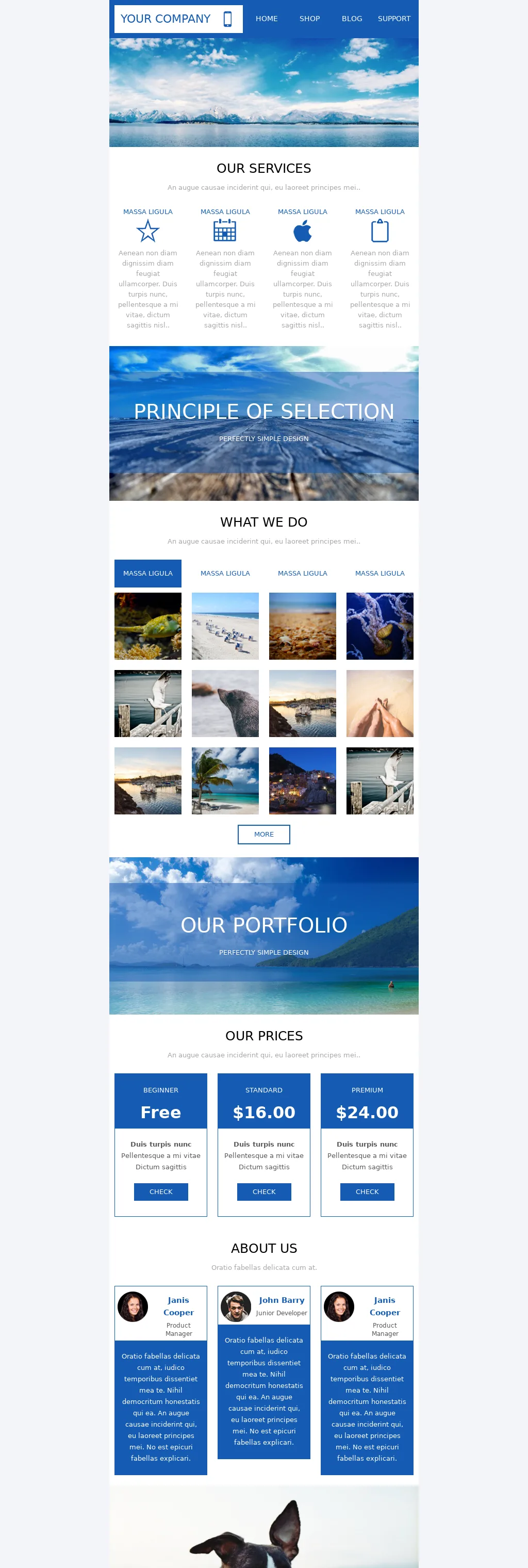
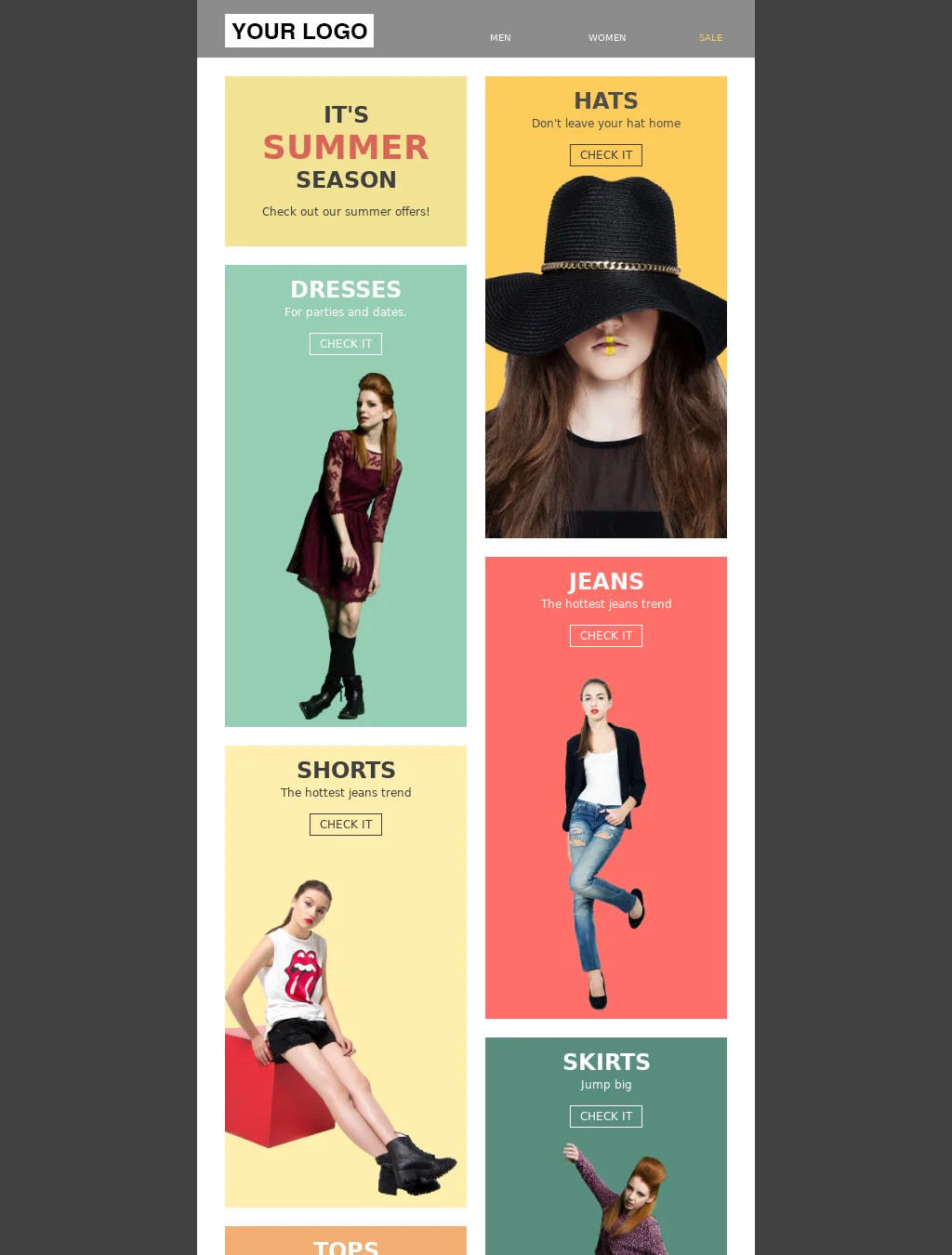
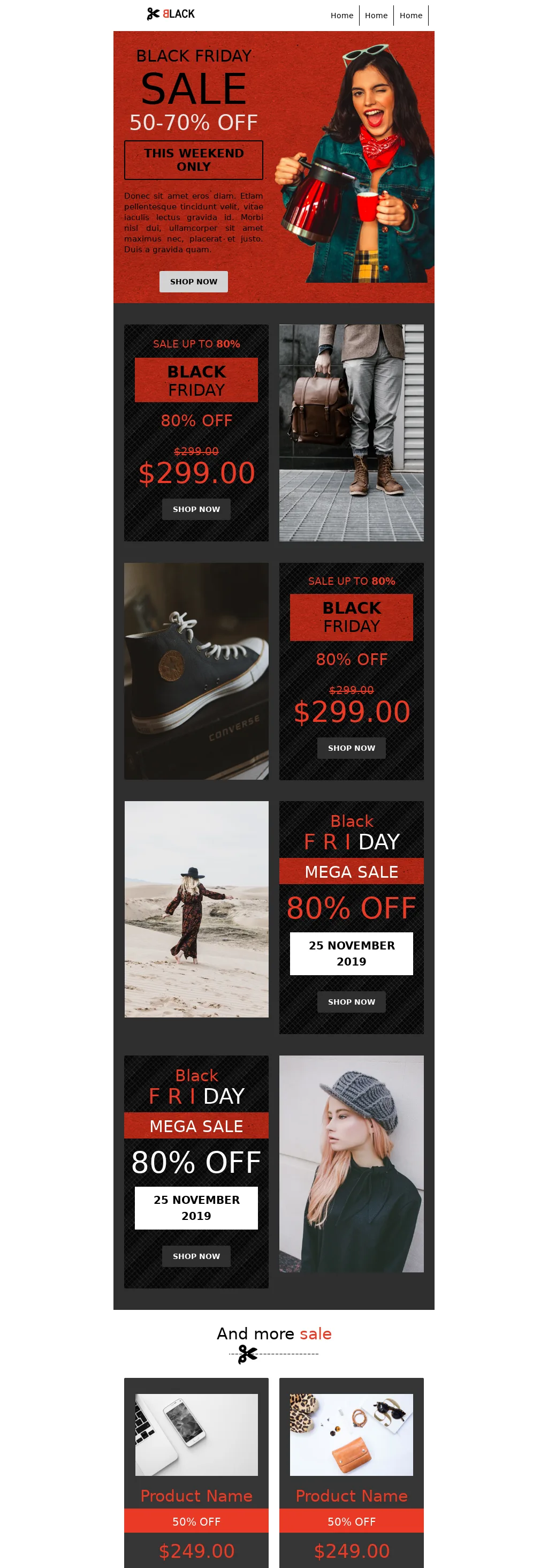
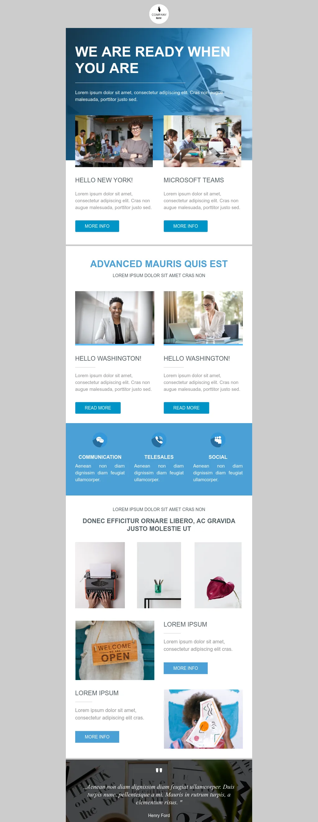
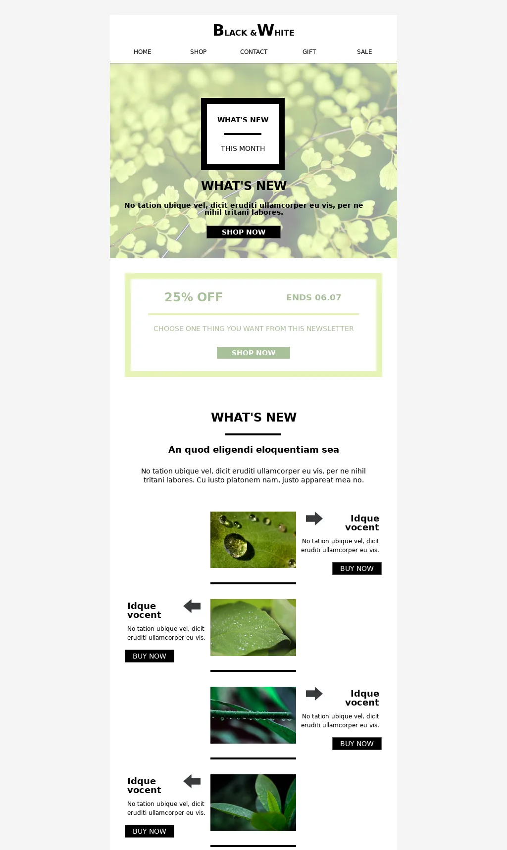
Ready-made layouts for newsletters, transactional emails, product launches, and lifecycle campaigns. Apply your theme, update the copy, and send.

Filter contacts by behavior, plan, activity, or any property you've collected. We deliver only to those who match, higher engagement, less waste, more revenue per send.


Delivery, opens, clicks, bounces, and subscription trends. Switch between hourly, daily, weekly, and monthly views. Export when you need to share.
Plug into your favorite apps and automate your workflows, no technical setup required

Gyula Németh has worked in HTML email since 2013. Before BlueFox Email, he co-founded edmdesigner.com, chamaileon.io, and emailhero.io, including enterprise-grade platforms, where he served as CTO. His focus has always been the same: emails should render consistently across real inboxes including Gmail, Apple Mail, mobile clients, and Outlook.
No monthly subscription. No contact-based billing. No features locked behind tiers. Buy a send pack when you need it, that's it.
Always included, every plan, every send pack:


