Appearance
Analytics
The Analytics section in your application provides a comprehensive analysis of email performance, subscription trends, and user engagement metrics. It is designed to cater to multiple scopes, such as account, project, transactional emails, triggered emails, campaigns and subscriber lists. Each type of statistic is presented with clear visuals, detailed filters, and actionable insights.
Email Card Analytics
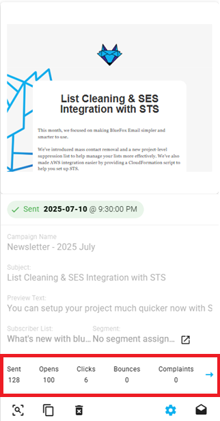
We provide the following analytics for all of our email types (transactional emails, triggered emails, and campaigns): sends, opens, clicks, bounces, and complaints.
You can view these analytics on the email cards, located right above the action buttons for each email type:
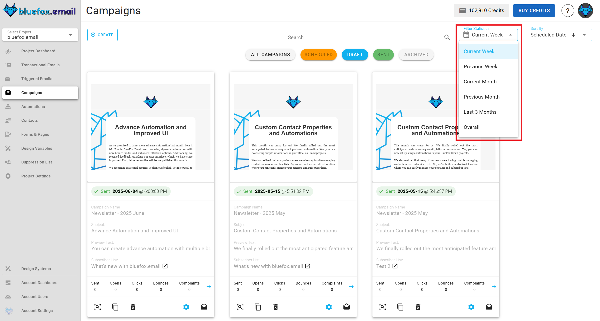
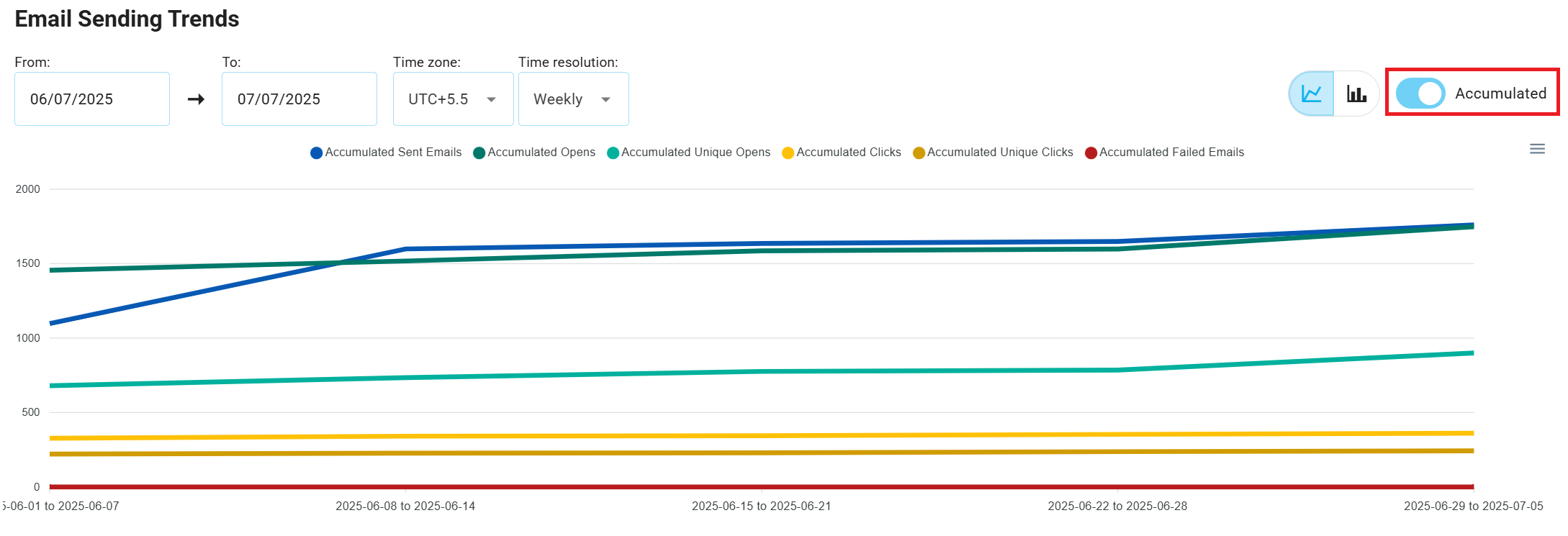
By default, these numbers reflect stats from the current week. If you want to change the time period, select from the options highlighted in the screenshot below: current week, previous week, current month, previous month, last 3 months, or overall.
Overall Banners
At the top of every statistics page, an overall banner displays key metrics in separate boxes. Each box has a title and a numeric value that provides a quick overview of email performance or subscriber activity.
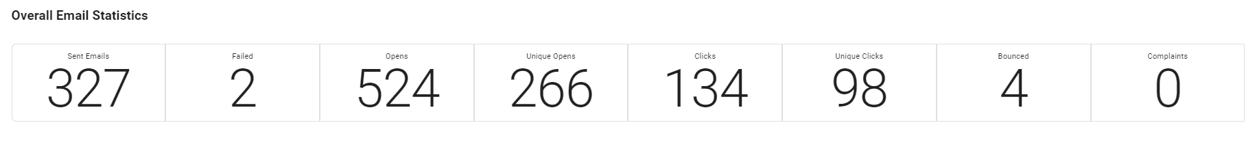
Overall Email Statistics Banner
The Email Summary Banner provides key email performance metrics, such as sent emails, failed, opens, unique opens, clicks, unique clicks, bounced, and complaints. This banner is essential for tracking email performance at a glance, enabling users to monitor engagement and delivery quality effectively.
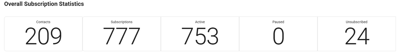
Overall Subscription Statistics Banner
The Subscription Overall Banner provides an overview of your total subscribers and their current status. It displays metrics such as contacts, subscriptions, active, paused, and unsubscribed. This summary is key to understanding the distribution of your audience and tracking changes in subscriber engagement and retention.
Email and Subscription Charts
Email Metrics
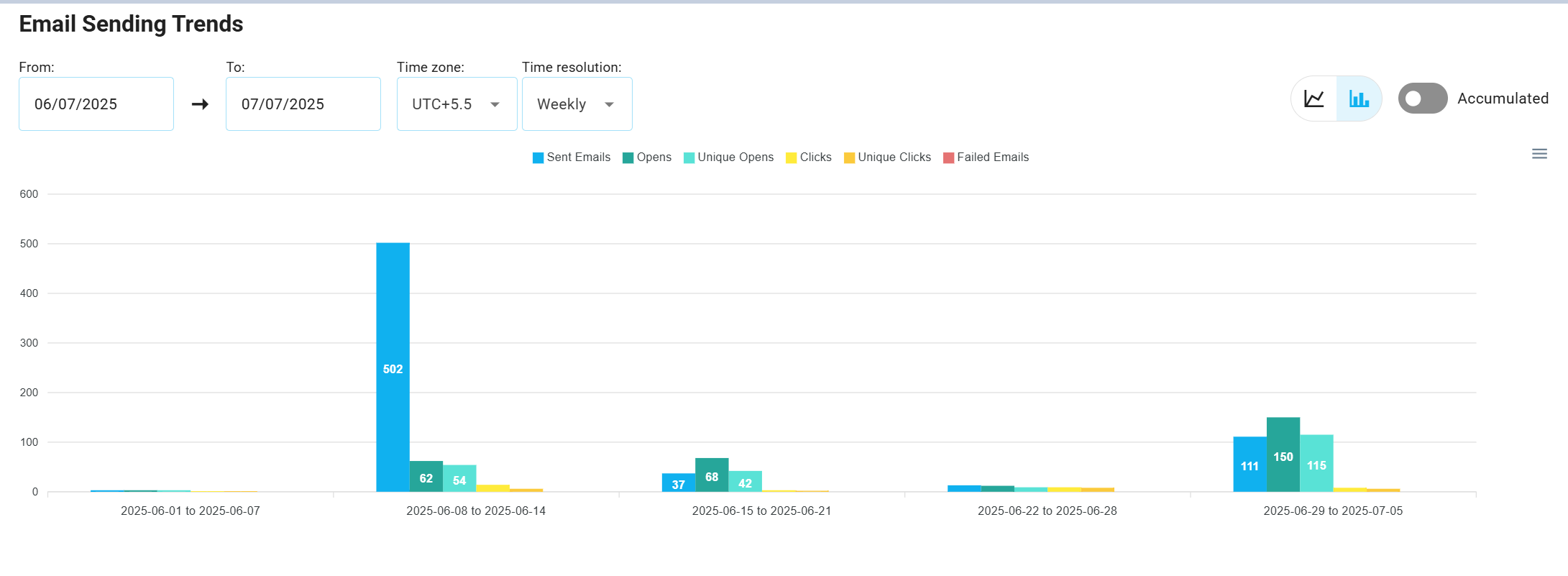
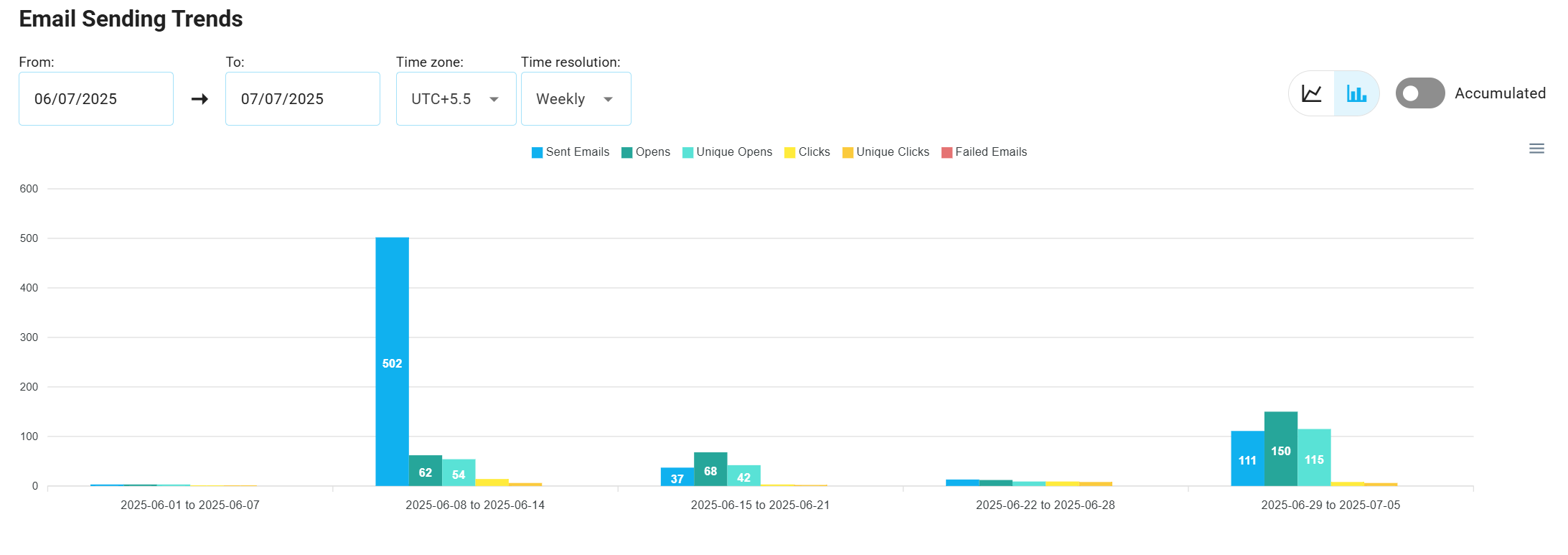
Email-related charts track key performance indicators for emails, including: sent, open, unique opens, click, unique click, and failed.
These metrics are displayed using either bar or line charts, depending on the user's preference for visualizing comparative data or tracking continuous trends.
Subscription Metrics
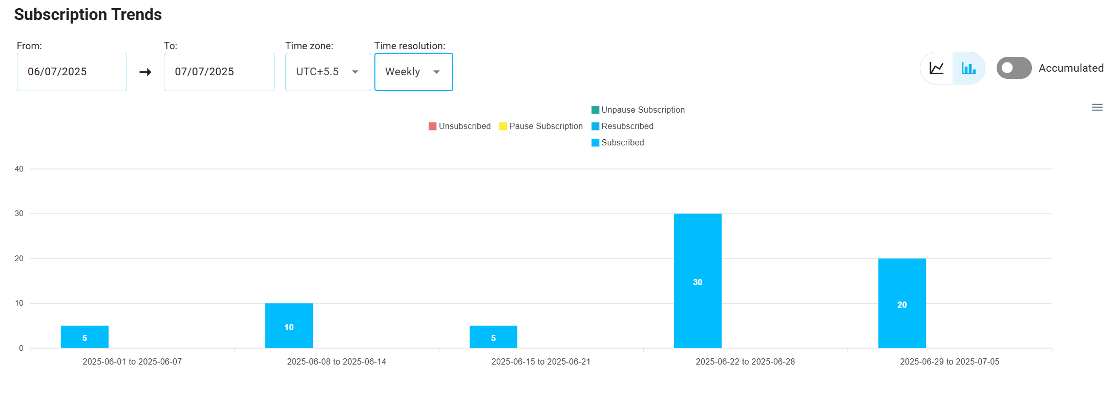
Subscription charts track key behaviors, including: subscribed, resubscribed, unsubscribed, paused subscription, and unpaused subscription.
In the subscription metrics section, users can monitor activities like new subscriptions, unsubscribes, paused, and resumed subscriptions. These metrics can be displayed as bar or line charts, offering flexible analysis of subscription trends.
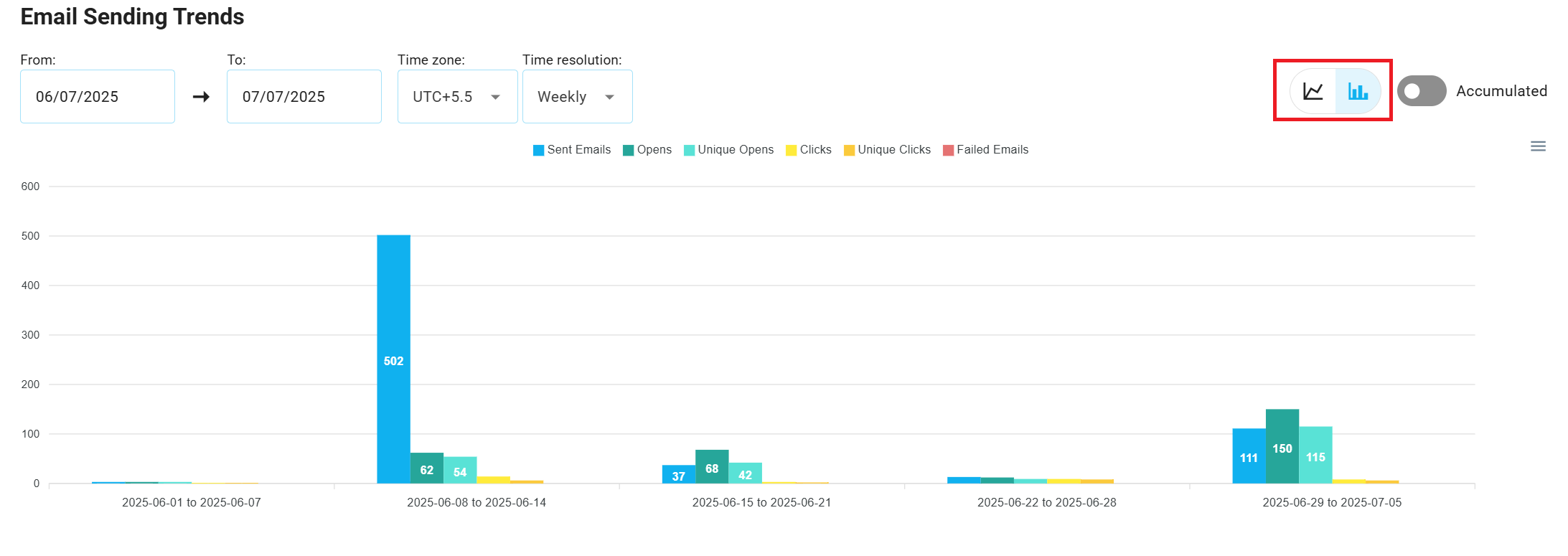
Charts and Graphs
The statistics page's main section features interactive charts that allow users to monitor and analyze the performance of their email and subscription metrics. These charts provide both comparative data points and continuous trends over time, enabling users to choose the most relevant view for their analysis.
Chart Types
Bar Charts
Bar charts visualize comparative data points, highlighting how data points differ over time. They are ideal for comparing performance across specific periods, such as the number of emails sent or new subscriptions within a given timeframe.
Line Charts
Line charts showcase continuous data trends over time, making it easier to track data changes and trends.
These charts are especially useful for monitoring long-term patterns, such as tracking email or subscription growth over weeks or months.
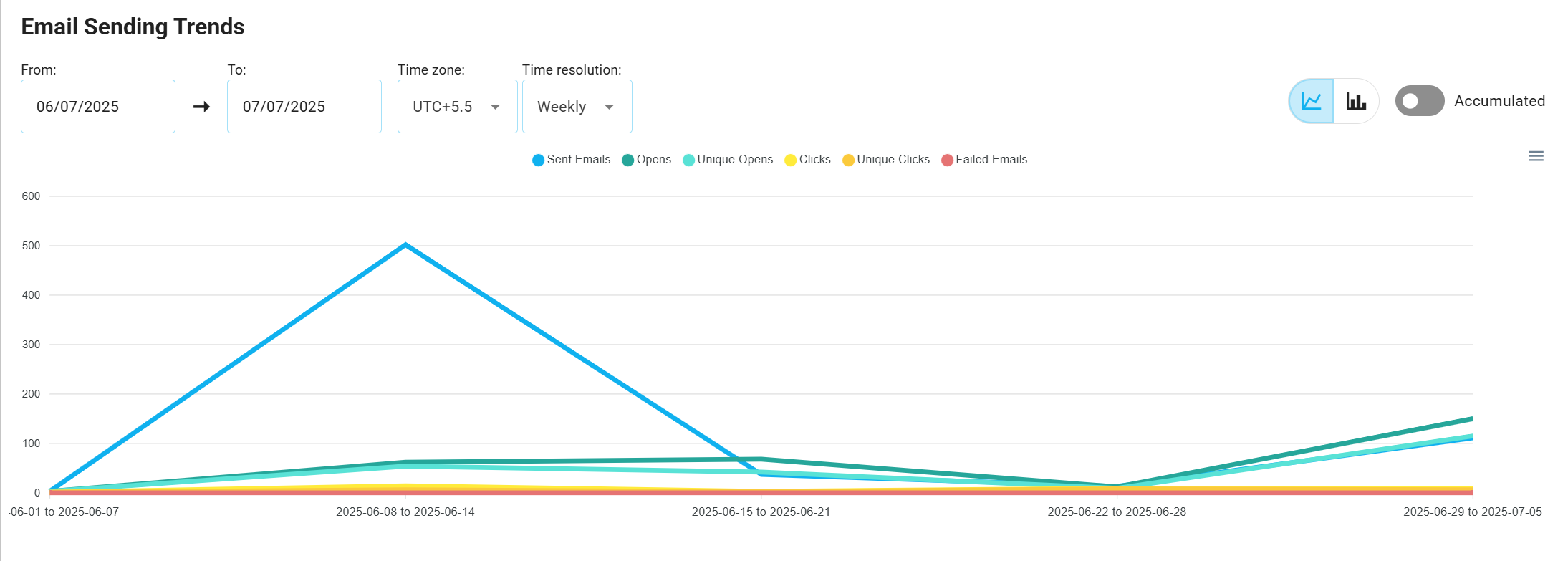
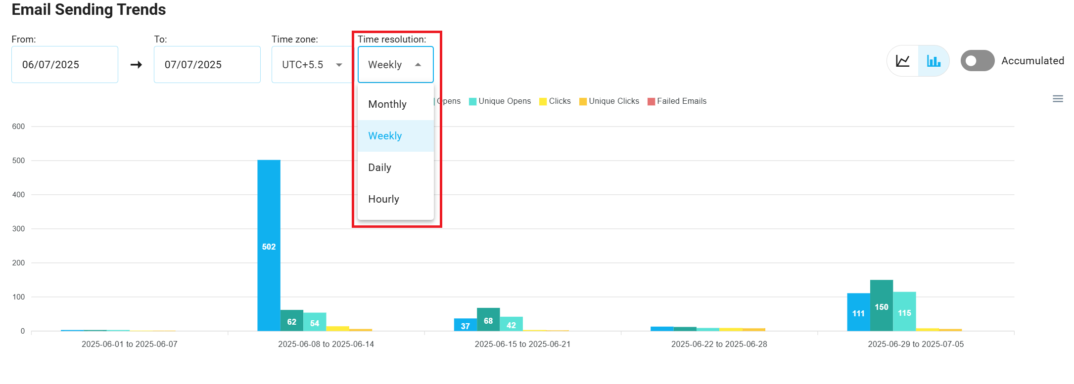
Chart Controls
Chart Type Switcher
Users can easily switch between bar and line charts using the chart type toggle button. This allows users to visualize the same data either as discrete, comparative data points or as continuous trends.
Time Interval Switcher
Users can select from various time intervals to refine the displayed data, allowing them to analyze performance with different levels of granularity.
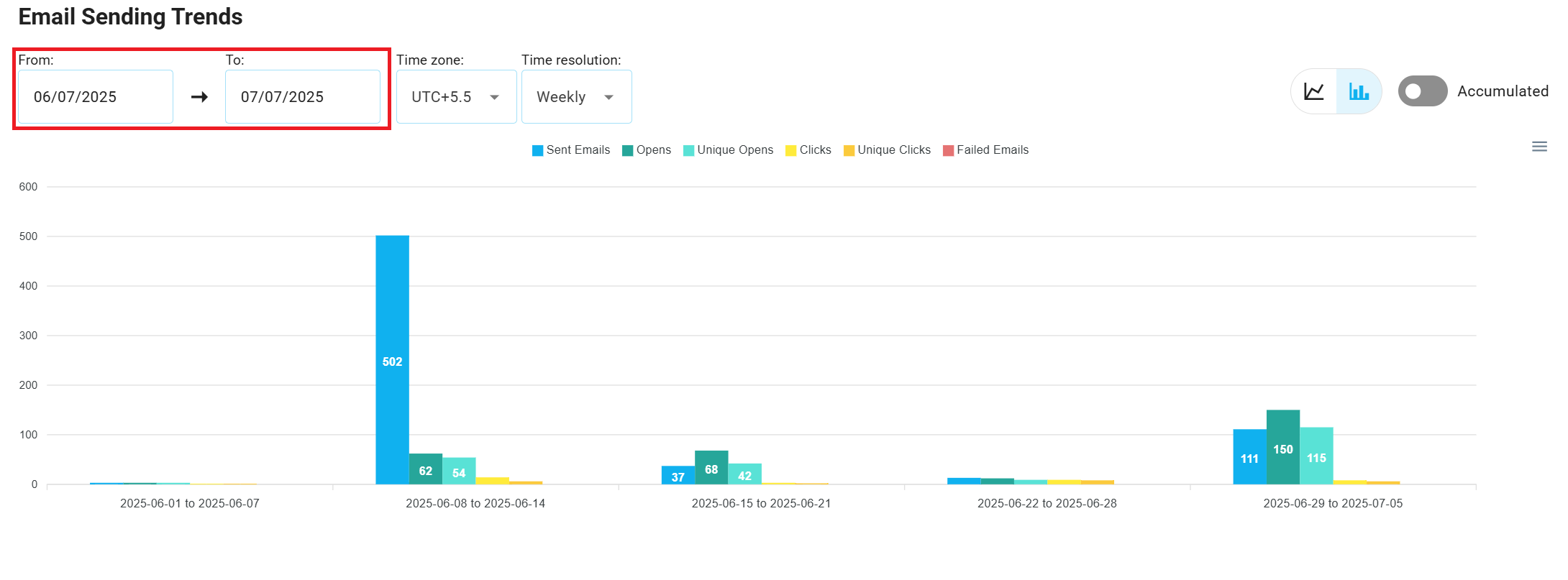
Filters
Filters allow users to refine data by selecting custom start and end dates, helping isolate trends and identify patterns within specific timeframes.
WARNING
- For daily, weekly, and monthly views, the maximum filter interval is 1 year.
- For hourly view, the maximum interval is 7 days.
Accumulated vs Regular Views
This feature allows users to toggle between accumulated and regular data presentations.
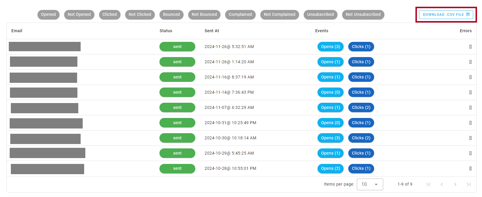
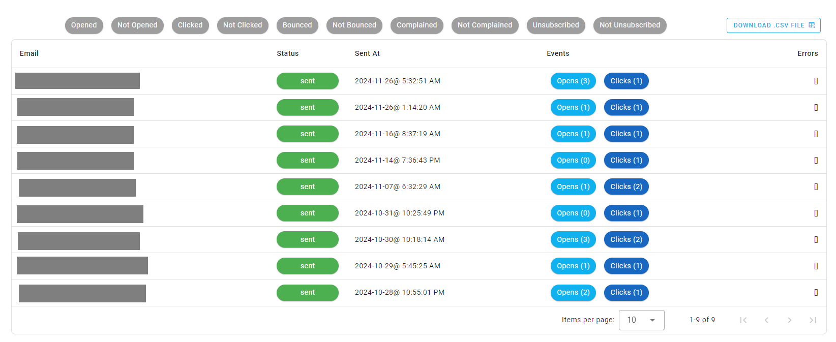
Data Table
Beneath the charts, detailed data tables provide raw, event-level information, allowing users to drill down into specific emails or subscribers.
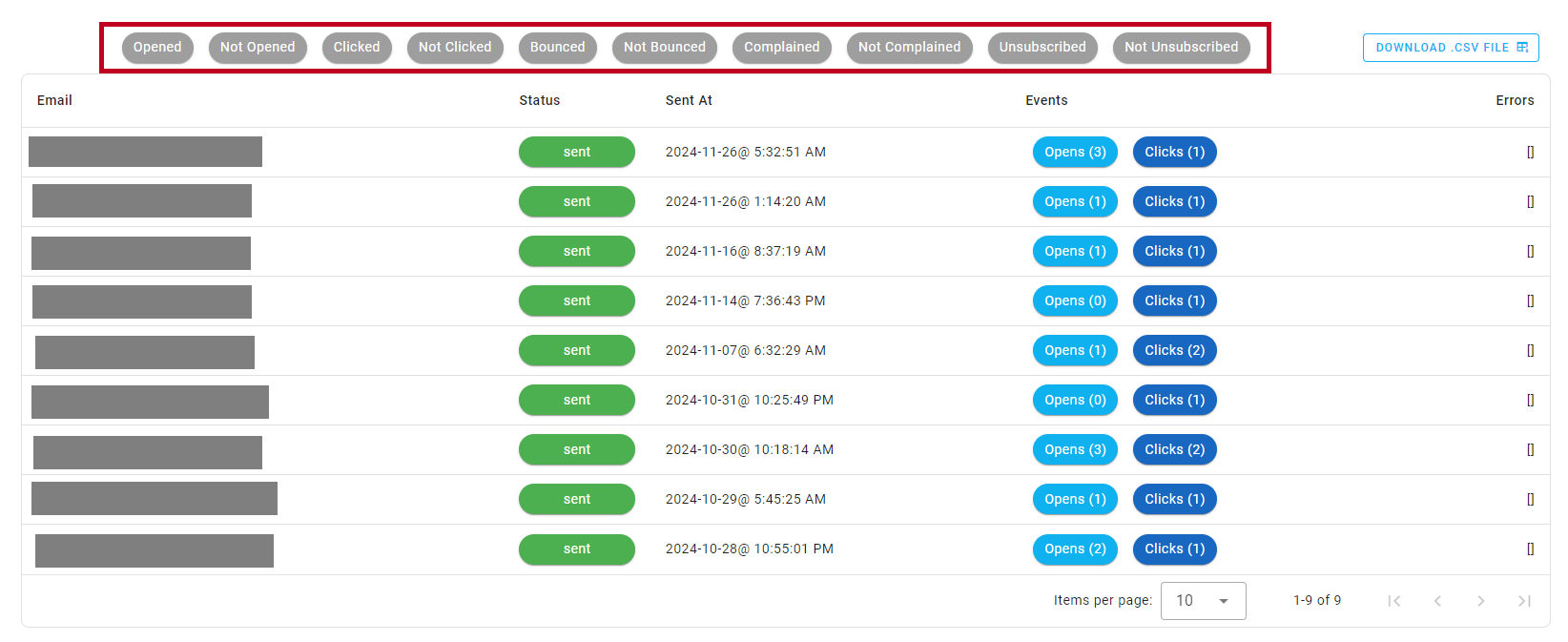
Filtering the Data Table
Users can filter the data in the table by selecting one or more filter options.
Download as CSV
To facilitate data extraction, users can download the filtered data table as a CSV file.